27 July 2010

Tuesday Title: The Tomb of Ligeia

Each Tuesday I post a still from the opening titles of a film - as a celebration of great title sequences, cinematic use of typography and the feeling of anticipation in waiting for a film to start...

Today: The Tomb of Ligeia (Roger Corman/1964)


The film's opening is great: Vincent Price - as the fantastically named Verden Fell (who joins Pat Hingle's Bobo Justus in The Grifters and John Hurt's Jellon Lamb in The Proposition as one of the best movie character names ever) - is standing firm over his late wife's coffin, certain of foul circumstance; said late wife's (duel-role-playing Elizabeth Shepherd, as second of these two ladies: the Lady Rowena Trevanion and the Lady Ligeia herself) eyes open, startled by a cat on her tombstone - Price explains it away as a nervous post-death twitch. She's eventually buried, and the opening titles (designed by Peter Howitt and Francis Bodker) appear over some very nice, Gothic illustrations - which look like something Francis Bacon might have dreamt up had he been a commercial illustrator.

The film is based on Edgar Allen Poe's short story 'Ligeia' and, true to his auteur status and reverence among horror filmmakers, it's his name that claims position above the title in Roger Corman's 1964 film. But Corman's unexpected and brooding use of landscape (notably his insistence on using found locations: Castle Acre Priory, Norfolk - not a million miles from me), particularly in the film's pre-opening credit sequence, is just as (visually) evocative as the discernible doses of Poe's macabre wit within the film's script, adapted by Robert Towne.

The opening is a suitably creepy and eloquent introduction to Ligeia - both the film and the wraith-like presence of Fell's almost ever-living wife. And that pesky black cat perched ominously on the tombstone proves more fateful than we first assume. (I was surprised to read that some folk see it as one of Corman's lesser Poe adaptations. I thought it was one of his most interesting and memorable; the inventive framing and expressive use of vibrant colour made the film stand out for me.)

Also worth a mention - Price has one of the best lines in the film, too. Just check out this choice slice of Fell's:

"Christopher, not ten minutes ago I... I tried to kill a stray cat with a cabbage, and all but made love to the Lady Rowena. I succeeded is squashing the cabbage and badly frightening the lady. If only I could lay open my own brain as easily as I did that vegetable, what rot would be freed from its grey leaves."

Wonderful.

The film also has one of the best posters of the sixties, too:

21 July 2010

CFF '06 Reviews: Visit Palestine

Visit Palestine (Katie Barlow/2005)


“Life is ephemeral,” states Caoimhe Butterly, a 24-year-old Irish peace activist, toward the end of Katie Barlow’s emotionally searing documentary VISIT PALESTINE. These three words sound resolutely frank yet hopeful coming from a woman who has spent years tirelessly aiding innocent Jenin civilians under attack from Israeli soldiers. Butterly knows just how temporary human life can be, having witnessed first hand the deaths of innumerable Palestinians (some of whom were her close friends) and by being a victim of the conflict herself; she was shot in the leg whilst leading groups of children to safety.


Death is an everyday occurrence in Jenin. Barlow critically and unflinchingly depicts this with an honest, responsive immediacy. But VISIT PALESTINE’s tone is also wishful; its message one of future hope. Numerous shots show how Butterly’s work has made a direct and integrally positive impact on the families, who see her not only as a friend, but also a saviour. The admiration is mutual, with Butterly being both tenderly loyal and fiercely protective of the people she’s committed to helping. The film sensitively relays deeply saddening testimonies from many victims’ families: one woman talks of her husband’s death with sincere candour - loss etched into her face. Barlow’s camera, like Butterly herself, intently absorbs every word; the moment is quietly devastating. VISIT PALESTINE is an important and much-needed film. It stands as a necessary testament to a singularly courageous person with an unwavering mission to do work that matters; one reason, of many, why the film should be seen.

CFF '06 Reviews: Goblin Wars/The Great Yokai War

Goblin Wars/The Great Yokai War (Yôkai daisensô) Takashi Miike/2005

Take the best parts of The Dark Crystal, splice in some of the more sinister scenes from Labyrinth, then add the surreal vision of Japanese director Takashi Miike and you end up with GOBLIN WARS/THE GREAT YOKAI WAR, his first foray into family-orientated filmmaking. Tadashi (Ryunosuke Kamiki), a boy with an unsettled home life, becomes blessed by a festival dragon to be the Kirin Rider - a mystical title rendering him the chosen one to release a netherworld of goblins from the clutches of a vengeful force, the Yomotsumono, which is intent on creating hell on earth. Like a budding Camelot in Harry Potter clothing, Tadashi goes on a quest with a band of forest-dwelling Yôkai (spirits) to retrieve a sword and bring peace to the world.


Miike’s film is a visual, illusory treat. It uniquely pits gigantic scrap metal CGI robots against a bizarre army of half-human/half-puppet creatures through numerous exciting confrontations in a warped variation of the Good vs Evil story. Dazzling photography - which illuminates apocalyptic reds in the inkiest of night skies - creates a fantastical arena in which childhood adventure is vibrantly turned on its head. It’s a strange, beguiling fairytale, sure to thrill adults and children alike - though it mixes some gory moments in with the comic escapades. GOBLIN WARS shows Miike as adept at youthful adventures as he is with his usual, darker fare. It contains a trace of knowing charm, too, with some cheeky references to both Indiana Jones and samurai films. Its lightness of touch delights even when it scares - especially in the moving and monumental final battle.

CFF '06 Reviews: Safety Last!

Safety Last! (Fred C. Newmeyer, Sam Taylor/1923)

Hurray for Harold Lloyd! Eighty-three years after making it to the top of DeVore’s department store - in one of the most audacious comedy stunts ever filmed - he’s made it to the CFF. The much-loved 1923 silent classic, SAFETY LAST!, is screening in a rare print this year. It was Lloyd’s first full-length feature, made after a decade of shorts, and it’s still an indelible classic of pitch-perfect comic timing. The story is simple: Lloyd, as The Boy from Great Bends, gets a job in the city making big bucks for his new life with his girl. He chances upon a publicity stunt to scale his workplace that could net him an easy $1000 - a cinch for our desperately love struck, hapless hero, surely. But a multitude of unforeseen, and nail-biting, obstacles up the twelve-floor building might almost just prevent him from reaching the top.


Lloyd was an endearing screen presence; his circular black glasses amplifying the innocently expressive eyes behind them - but always letting the audience in on the japery, with a quick wink and a nudge. When he gets into comic scrapes, we slip and slide along with him, not quite knowing where he will land, but each time gasping, then giggling, at the always-witty and inventive outcomes. SAFETY LAST! stands as a testament to his ingenuity as a performer, never better than in the famous, death-defying clock sequence. Lloyd was the grand fool of slapstick, but always an artful and creative one. He inspired instant wonder - all with just a pair of glasses and a smile. 

CFF '06 Reviews: Akeelah and the Bee

Akeelah and the Bee (Doug Atchison/2005)

AKEELAH AND THE BEE follows in a refreshing way the vogue for films that explore the often tense, but rewarding world of the spelling bee. The 2002 documentary Spellbound - along with this year’s Bee Season - set the stage, but Doug Atchison’s new film - receiving its UK premiere at the Festival - rounds out the competition by adding a rose-tinted glow to the trend. Bright 11-year-old Akeelah (Keke Palmer) lives with her single mother (Angela Bassett) in South L.A. and is caught up between hanging out with friends and achieving good grades at school. Gifted with a vast vocabulary, she is persuaded by her principal to enter a local spelling bee under the tutelage of philosophical former spelling champ Dr. Larabee (Laurence Fishburne). After she wins, Akeelah feels the pressure to go national with her linguistic talent, but the path to success is littered with obstacles. 


Revelatory life lessons abound for the characters, and the film has a nicely relaxed feel, helped by the sharply lyrical script. At times events feel drawn from well-used formula and veer close to being uplifting-by-numbers - with many montages of Akeelah selflessly guided by her extended community - but the film is unfettered by its own sentimental charm. The tone is blissfully good-natured, aided by the diffuse, golden-hued cinematography and Palmer’s vibrantly confident performance. The film winds its way into the affections all the same; so confident is the film you can’t help being carried along on Akeelah’s journey. And for what it does - in a simple, heartfelt way - it's almost word perfect.

CCF '06 Reviews: Sympathy for the Devil

Following on from yesterday's slapstick post from the Cambridge Film Festival, here are a few film reviews, jazzed up with a few retrospective edits and tweaks here and there, again for fun and posterity. The aim with these reviews was to be as concise as possible (max. 300 words), to promote the films (i.e. assist in the selling of tickets) and give a flavour of the films in question (hopefully).

Sympathy for the Devil (Jean-Luc Godard/1968)

It’s no surprise that two of the twentieth-century’s most idolised bands both extended their musical proclivities to the silver screen. 1968 saw the Beatles explore tripped-out animation in Yellow Submarine, whilst the Rolling Stones - often considered the artier, grittier band - opted for this documentary essay by Jean-Luc Godard. Godard wanted to work with either band on a film; the Beatles declined, the Stones accepted. SYMPATHY FOR THE DEVIL - a UK premiere screening in a new print - intercuts scenes of the Stones rehearsing the eponymous song with vignettes exploring themes such as race, societal (in)difference, sex and cinema itself. Godard lays out a cultural map and draws allusive comparisons between the nature of performance and political environments, addressed through ideas of revolutionary imbalance that surround progressive artistic creation. Or something to that effect, anyhow.


SYMPATHY is an enticing film for hardcore devotees of Godard or the Stones, but more discerning viewers may feel discontented by the film’s drawn-out, fragmented structure. As the rehearsals proceed, more of the song is tantalisingly revealed, but it’s often abruptly halted for lofty polemical assertions - though perhaps no bad thing with Godard in charge. More than anything, the film’s photography is vibrantly assured; Godard’s camera highlights bloodied streaks on a white robe (flagging it as a beacon of despair) and interwoven scenes of a woman spray-painting political street slogans (Cinemarxism!) are filmed in bleak, misty hues. The Stones’ green and orange-panelled recording studio seems almost homely in comparison - with the Gallic auteur himself handing the Stones cups of tea in the penultimate scene. It’s no Medium Cool, but tepid Godard can still hypnotise.

Addendum: for the record, I personally hated Sympathy - it was one of Godard's most tedious, self-involved and lazy films. But, in accordance with the brief I was set at the time, I had to attempt to be as fair as possible, and help the festival lure in Godard-loving punters and general audiences alike. Maybe some of my dislike showed through, who knows. Note the back-handed use of the word 'hypnotise'. As in 'induce sedation'.

20 July 2010

Tuesday Title: Lifeboat

Each Tuesday I post a still from the opening titles of a film - as a celebration of great title sequences, cinematic use of typography and the feeling of anticipation in waiting for a film to start...

Today: Lifeboat (Alfred Hitchcock/1944)


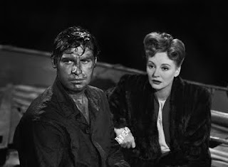
The opening titles of Hitchcock's Lifeboat aren't exactly remarkable for their use of inventive typography (a rather standard-for its-time title insert), but it was one of Hitch's most memorable opening sequences all the same. As soon as the film started I'd been immediately introduced to one of his best screen characters - with a nod to Steinbeck, who wrote the script at Hitch's insistence - in Tallulah Bankhead's stranded socialite Constance Porter.


It's a smart, effective and very funny opening sequence: after a masterful pan over the downed ship's various flotsam covering the ocean surface (which include a copy of the New Yorker), Hitch's camera rests on a woman in a boat. Surveying the sinking debris of the ship around her - from the relative safety of the small lifeboat of the title - the unblemished, and still impeccably-dressed, Connie lights a cigarette, glances at a ladder in her tights, and tuts, gloriously ignoring the mayhem around her.


When a survivor, Kovacs (John Hodiak), approaches the lifeboat, she grabs her camera and films him struggling to board before just about managing to lend him a perfectly-manicured hand. Capturing a good story comes first for Connie.

Bankhead and Hitchcock ensure that the opening of Lifeboat establishes just the right tone. It's an excellent and endearing film, but also gripping: amid the witty banter and hardy spirit there's some pertinent commentary on the eye-for-an-eye tactics of war that supply sufficient social-political ballast to weigh the lifeboat's passengers down. But it's eyes forward for Constance all the way. Her presence raises the film several leagues to greatness. Wonderful characters deserve wonderful introductions. Bankhead delectably helped keep Lifeboat wondrously floating along.

Sample dialogue: referring to using her fake diamond bracelet as fish bait:  

"I can recommend the bait. I know - I bit on it myself."

Gawd love 'er.

CFF '06 Slapstick Profile

I've been scouring my (digital) archive files and stumbled upon a few pieces I wrote for the Cambridge Film Festival a few years back (a profile on slapstick, many online and print film reviews, interview with a documentary filmmaker). They were, variously, used on their website, touring presskit and in the festival brochure. These pieces aren't still up on the website (obviously, it's been a while) so I wanted to post them up here for posterity, fun and, well, because - why not.

Below is my profile on the CFF's 2006 strand of slapstick movies. The brief was to make mention of a few key films included in the strand and to, hopefully, drum up a bit of interest in slapstick and several other films linked to it. (I've made a few retrospective editorial tweaks here and there because a bit of time and distance can throw up the odd shameful grammatical/spelling snafu in need of revision.) It's not the most in-depth or expansive analysis on slapstick - but nor, if I remember correctly, was it intended to be - and if I were to write it now I'm sure I'd change a fair bit. Hindsight, eh. It was a giggle to write (and a blast to research) none the less.

Buster Keaton in The General (1926)

I remember as a kid watching Tom & Jerry cartoons. Every Saturday they had me rolling on the floor, giddily laughing, with wide eyes fixed to the telly. They were usually shown before or after some old black & white film starring, say, Charlie Chaplin or Laurel & Hardy. It wasn’t until I got older that I realised that these old films and Tom & Jerry had a lot in common, of course: both double-acts shared an unwavering desire to entertain; and both were, by and large, denied a voice. 

Actual jokes weren’t always necessary to create big grins and belly laughs. It was the slip-ups, the frantic chases, the paint tins precariously balanced above doors and the pies in faces that had us in uncontrollable fits of giggles: Hardy slapped Laurel, Jerry bettered Tom - it was the same smile-inducing thing.

Slapstick, as with all great comedy, often works best as a series of individually remembered moments. One-off gags, goofs and pratfalls come rushing back to us at the mere mention of our favourites films' titles. That’s not to say the whole films aren’t memorable, but slapstick is joyfully made up of the sum of its parts: with Buster Keaton’s THE GENERAL we surely recall him frantically attempting to throw the sleepers ahead of the hurtling train whilst pinned to its front; in Chaplin’s THE GREAT DICTATOR we see his Adenoid Hynkel playfully bouncing the illuminated, plastic globe in the air; and any of Groucho Marx's one-liners in DUCK SOUP can surely be summoned up in a heartbeat by his longtime fans.

Charlie Chaplin in The Immigrant (1917)

An entire strand at the Festival – SSSH! IT’S STARTING! – is devoted to showcasing the most hilarious shorts and features made during slapstick’s golden period: three Chaplin greats (THE PAWNSHOP, EAST STREET, THE IMMIGRANT) provide a chucklesome triple bill; and Buster Keaton in GO WEST and Harry Langdon in THE STRONG MAN all receive revivals. Most exhilarating of all, Laurel & Hardy and friends get into more fine messes in the strand SHORT FILMS, BIG TROUBLE! and Harold Lloyd scales delirious heights in SAFETY LAST! Tears of joy are compulsory.

It’s not always the silents that instantly breakout mile-wide smiles or split those sides. Slapstick finds a home in a variety of its antecedent performers: Steve Martin - in the wake of the likes of Jerry Lewis - took the best of Chaplin and co. and posited it within his own absurdist worldview in films like THE JERK and ALL OF ME. So, too, did Woody Allen; his early comic masterpieces SLEEPER and BANANAS contained enough surreal sequences to call him a truly practised devotee of slapstick’s finest tradition. It continues to be a core comic staple.

Check out Michel Gondry’s THE SCIENCE OF SLEEP, also showing at the Festival, and find out anew why his fantastical stories - deeply-rooted in the slapstick style - make indelible comic marks on the brains and hearts of contemporary cinemagoers. Silent or with sound, it’s ongoing proof that with great comedy comes great variety; often best thick and fast, skidding to an unbalanced halt in front of our eyes - and ending with a custard pie slapped squarely in the kisser.

I'll post up the other pieces (reviews, interview) soon.

13 July 2010

Tuesday Title: Jackie Brown

Each Tuesday I post a still from the opening titles of a film - as a celebration of great title sequences, cinematic use of typography and the feeling of anticipation in waiting for a film to start...

Today: Jackie Brown (Quentin Tarantino/1997)


She's still foxy and she's still called Brown, but despite the clear and present allusion to one of Tarantino's obvious Blaxpoitation faves, we're some way off Foxy Brown. Jackie Brown is a film made in Foxy's image, an avid fan's homage to Pam Grier.

I finally saw it after years of thinking to not bother, having never been someone truly taken with QT's film world. I'm glad I did eventually see it, as it may just be the best thing he's done (along with a grab bag of bits from both Kill Bills): the smart-ass dialogue is kept to a minimum - and feels like it comes from the character's mouths, not his; it features his best selection of pop-soul hits (particularly a personal all-time fave, Bobby Womack's 'Across110th Street'); and contains two of his very best characters: Jackie herself and Max Cherry (Robert Forster).

I loved the opening: Grier on an airport conveyor belt for what seemed like a glorious eternity; the Womack song accompanying her as she elegantly glides throughout the entirety of the titles. Shot in profile in a blue Cabo Air uniform, and with unblinking gaze fixed on the distance, Grier commands the film frame right from the start. The yellow '70s-style - and very Tarantino - font appears bold, filling the frame, and constructed purely in the image of his inspiration. I'll take this over the opening strutting swagger of all those Reservoir Dogs any day.


At this point I could only hazard a guess at what may have been on Jackie's mind; the shot is cleverly composed to make us ponder who she is and what might happen to her. This image is what we have; one long, uninterrupted take. By the end of the film, 154 mins later, Jackie and Bobby Womack are paired again. And Tarantino's most invigorating and thoughtful film ends on an image as striking as its first, and just a touch more wonderful: Grier's face, now in close-up, smiling and all the more knowing and relaxed for having now worked out what she wanted to do with her life. I was with her all the way.

And how is it that Grier wasn't nominated for a Best Actress Oscar for this? Forster grabbed a supporting nod, though didn't win (it should've been a lead nom anyhow), but nothing for Grier. And I'll remind you that Helen Hunt and Jack Nicholson both won for As Good As It Gets. What gives? Daft and wrong, right there.

11 July 2010

At the Cinema: Predators

Predators (Nimród Antal/2010) USA/106 mins. *****


Welcome to the jungle. Eight lethally well-equipped tough guys (and one gal) get unceremoniously parachuted down on hostile, uncharted territory - a place of strange beasties and various tropical fauna (think Lost but nowhere near as confusing) - and are left to defend themselves against a pack of ungodly creatures unsportingly tracking them down, intent on making mincemeat of all and sundry. We know the hunters are alien Predators ("we never knew what to call them," says one character), but the game this time are Adrien Brody, in mumbling hunk mode, and a gaggle of unwanted earth rejects - whose number include a Yakuza assassin, sheepish doctor, Russian Spetsnaz soldier and numerous rebel military types. With guns. Lots of guns. Apparently alone and unwitting they have to work out why they're there in the first place whilst avoiding being ripped in two.


The structure and tone of Predators has a decidedly retrospective hue - a very 1980s hue to be precise; it nicely harks back in style to Predator '87. The events of Arnie's original are alluded to - but its sequel and the recent Alien vs Predator mash-ups are perhaps tactfully ignored - suggesting the film as a Superman Returns style reboot, not a strict continuation. But instead of adding unnecessarily tricky plot diversions or attempts to tie the whole Predator universe into a tidy bow, Nimród Antal (Kontroll, Vacancy) and producer Robert Rodriguez's overhaul is relatively fuss free and, for the most part, gets down to business, post-haste. Although the initial build up takes its time, and there are a few moments where it feels as if it doesn't quite know where it wants to go, but perhaps the narrative's hesitancy chimes with the characters' meandering trepidation - wouldn't we be cautiously nonplussed plonked down on forested, alien terrain with the inevitability of grisly goings-on around every tree?


The characters are rote and talk as if they've just read a manual on Tough Movie Speak, and personality is lacking, but we all know that we just came to see random hard-bodied nutjobs get picked off one-by-one by the invisible alien menaces in the most inventively gooey way possible. Although Brody caked in mud and Alice Braga, handy with a sniper rifle, are a pleasure to watch. There are a few successful plot curveballs thrown - not exactly major deviations from the template, but surprising nonetheless - and one or two not so successfully thrown around. And the film takes a bit of time out to ponder the question of who just exactly are the real predators here folks. But tish-tosh to rational  reasoning or plausible context. I enjoyed seeing the predators have a good old-fashioned jungle carve-up once again.

6 July 2010

Tuesday Title: Manhattan

Each Tuesday I post a still from the opening titles of a film - as a celebration of great title sequences, cinematic use of typography and the feeling of anticipation in waiting for a film to start...

Today: Manhattan (Woody Allen/1979)


Since roughly 1977 Woody Allen has famously used the same opening title design for each of his films, but one of several of his earlier films to not follow the long-held tradition of using white EF Windsor Elongated or Condensed on black is Manhattan. (The titles for What's Up, Tiger Lily?, Take the Money and Run, Bananas, Everything You Always Wanted to Know About Sex* But Were Afraid to Ask, Sleeper, Love and Death and Interiors appear without Windsor - the rest, to the best of my knowledge, all use the typeface.) We just have the black & white image of the vertical signage accompanied on the soundtrack by his celebrated monologue ("Chapter One. He was as tough and romantic as the city he loved...") and that Gershwin score.

For a film which has always been very much an open love letter to New York, a celebration of its romantic spaces, for him to have used the same opening titles as in every other of his films would've lessened the romance he extols and denied us the pleasure of sharing in his wonder. We wouldn't have seen the city itself as the real central character of the film. It's all in the name. The monologue, music and beautifully chosen and composed shots of Manhattan work together as an introductory, and very arty, slide show, mapping out the places Allen (as Isaac) wants to take us to over the course of the film.

4 July 2010

Here's a Thought: Psycho 1998 didn't kill off Psycho 1960

So, twelve years on and Hitchcock's Psycho didn't disappear when Gus Van Sant made Psycho mark two.


Instead of greeting the remake with outright dismissal as many folk did, I always thought it more interesting to look at it for what it tried to do. I was always under the impression that as much as it was a remake, it was also an experiment. In some folks' eyes it was just an exercise, a retread, a homage, a blasphemous shambles. Any or all of the above. But its formal daring and artificial qualities intrigued me more than they baffled or infuriated me.


Van Sant clearly wanted to do a near-direct retelling of the Psycho story (it's not exactly shot-for-shot) for whatever barmy reasons or creative purposes he had in mind. It may have been his love for the original. Or maybe it was just to shake up people's long-held adoration of a revered classic? Maybe he thought the Bates Motel needed a new coat of paint, a freshen up. Who knows? Either way, the reception to the outcome regretfully outweighed the merits of its intention.


It's not a masterpiece like Hitchcock's original. Of course it's not. Nor is it a particularly incisive or truly surprising film. But it's certainly worthy of discussion and further thought. It was commendable and entertaining for the most part. Vince Vaughan can't match Anthony Perkins' thin-lipped deceitfulness and he doesn't try to. But he does make Norman Bates boyish, icky, embarrassed. Anne Heche doesn't have Janet Leigh's subdued elegance or her nervy poise but she does a game impression of her, early '60s clipped accent and all. (And Van Sant appearing outside Marion Crane's office talking to a Hitch look-a-like, where Hitch himself stood in the original in one of his usual blink-and-miss-it cameos, was a witty touch.)


There are diverting pleasures throughout, both imitative and unforeseen. I was drawn in by sheer fascination alone. And can we truly say, with honesty, that a great many remakes, before or since, have been compelling or fascinating? Even if it's due to being drawn in via the in-built novelty factor. I stayed to see how the infamous shower slaying was to be played out.

I embraced Van Sant's version as a cheeky reply (a rebuttal?) instead of lazily fobbing it off as an insult. Folk, even today, and over a decade on, still find new ways to be appalled by the film: check out any online messaging forum with the words 'Psycho' and 'remake' as a subject line and see how the knee-jerk derision outweighs the thoughtful assessment. I always tow the line that if you love the original then why not be at least partially interested in what someone else could do the the same material? It's only essentially trading like for like anyhow.


After all, Van Sant's version didn't replace Hitchcock's. It's still there. Now we have two Psychos to choose from. What choice? Watch them both. Chronologically, or not. Accompanied by the original's three sequels or without them. I love the intrigue of the story of Psycho. I love Hitchcock for making Psycho, one of the most impacting and resonant films of the last 50 years. And I also like that Gus Van Sant took a creative route in reminding the world about it. It didn't need to be remade. Nothing does. But it accompanies the Hitchcock - it doesn't take its place.


*Now, I'd like to see some bold, fearless director take on Citizen Kane. Paul Verhoeven's version, say? Or maybe Brian De Palma's? Or how about a Farrelly brothers take? Such old, canonised stalwarts of cinema aren't forever untouchable, are they?

*I'm only partially joking. Perhaps.